
The language switcher is the primary navigation element for your international traffic. MultiLipi provides a dual-interface editor, allowing you to control the behavior and aesthetics of this element independently for Desktop and Mobile viewports.
This guide covers the configuration of Layouts, Positioning, and Brand Styling via the MultiLipi Command Center.
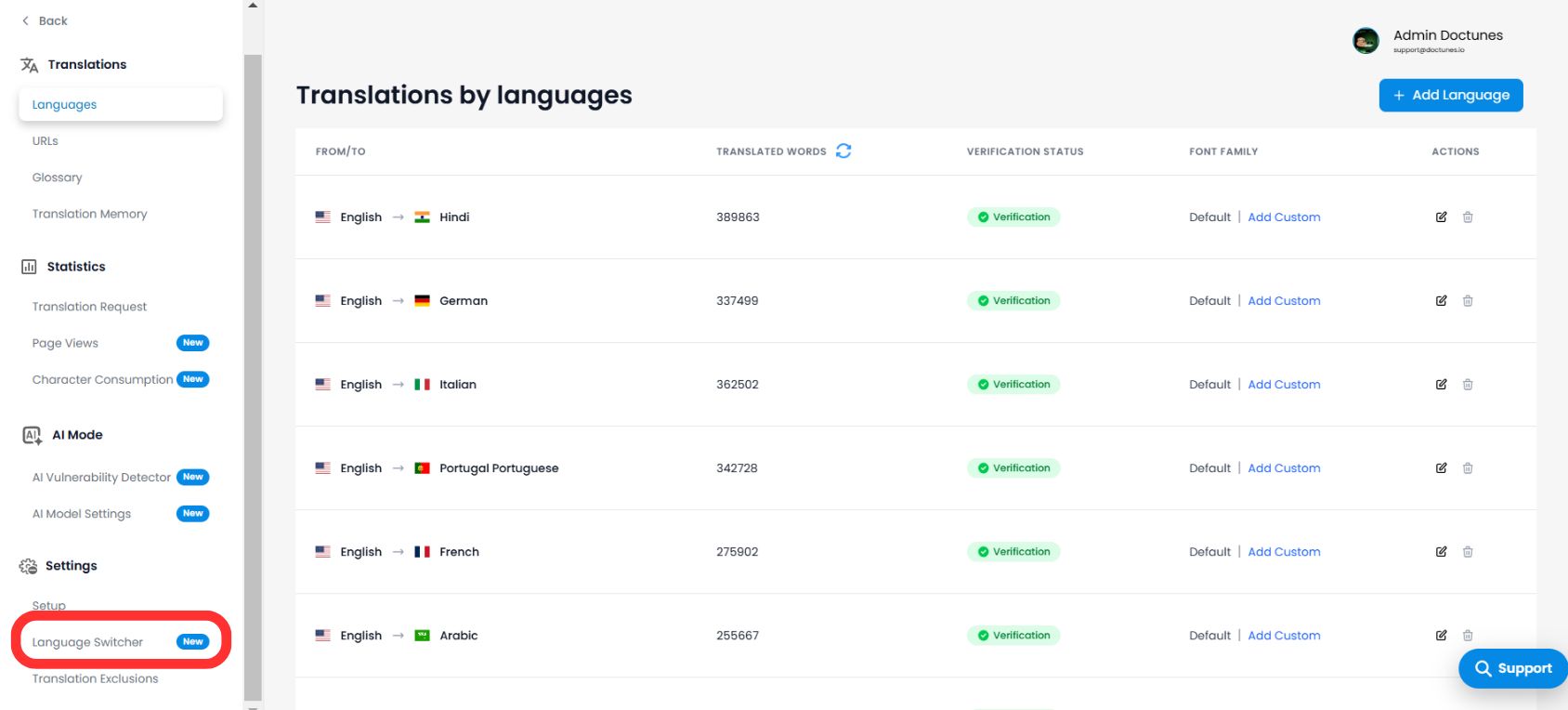
1. Accessing the Interface Editor
To begin customizing your frontend integration:
- 1Navigate to your MultiLipi Dashboard.
- 2Open Settings from the left-hand menu.
- 3Select Language Switcher.
💡 Pro Tip: You will enter the Switch Editor, which features a real-time preview canvas. Use the toggle at the top to switch between Desktop and Mobile views to ensure responsiveness across devices.
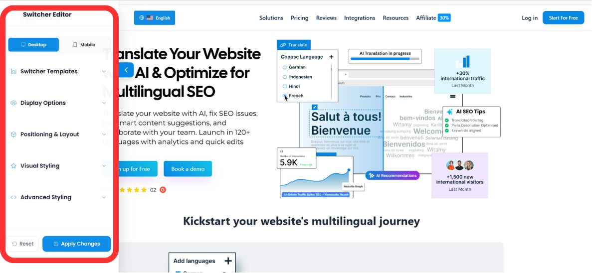
2. Step 1: Selecting the Architecture (Positioning)
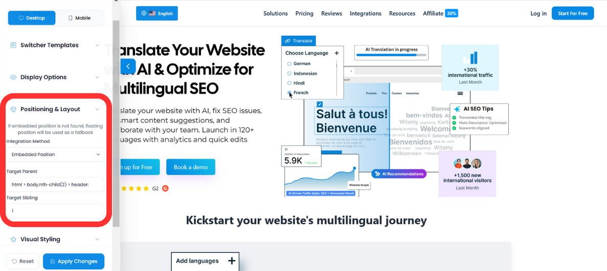
Define how the switcher behaves within your DOM. You have two deployment modes:
Mode A: Floating (Default)
Behavior: The switcher hovers over your content, anchored to a specific corner of the screen (e.g., Bottom-Right).
Use Case: Best for immediate visibility without altering your website's existing layout code.
Mode B: Embedded (Integrated)
Behavior: The switcher is injected into a specific HTML element you define (e.g., inside the Navigation Bar or Footer).
⚠️ The Fallback Protocol
If your specified HTML container cannot be found on a particular page, MultiLipi's Fallback Logic automatically reverts the switcher to "Floating Mode." This ensures users are never locked out of language selection, even if the layout changes.
3. Step 2: Visual Identity (Templates & Colors)
Align the switcher with your brand's Design System.
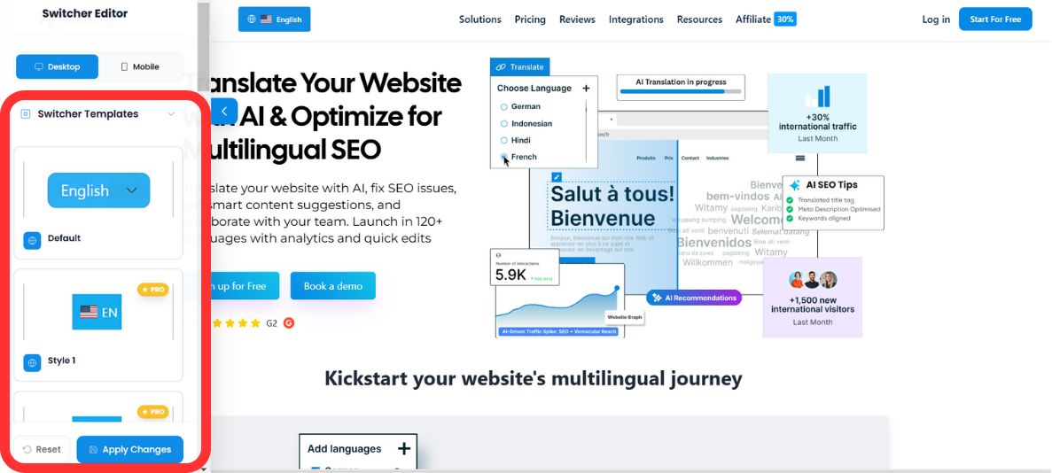
Template Selection
Choose from our library of pre-configured UI patterns to match your site's aesthetic:
Palette Integration
Override default styles to match your brand guidelines using the built-in Color Picker or raw RGB values:
- •Background Color: Match your navbar or button styles.
- •Text Color: Ensure high contrast for accessibility (WCAG compliance).
- •Hover Background Color: Sets the highlight color when a user moves their cursor over a language option in the dropdown — providing immediate tactile feedback.
✨ Configure Interactive Hover Effects
Give your language switcher a premium, native feel by adding interactive hover states.
- 1Under the Visual Styling tab, locate the newly added Hover Background Color field.
- 2Click to open the color picker, or manually input an exact RGB/RGBA value to match your brand guidelines.
- 3This color will display dynamically whenever a user hovers their cursor over a language option in the dropdown, providing immediate tactile feedback.
Display Options: Language Toggle Order
You no longer have to settle for an alphabetical list. You can now prioritize specific languages in your dropdown based on your primary target markets.
Set the Language Toggle Order
- 1Scroll down to the Language Toggle Order section in the left-hand Switcher Editor sidebar.
- 2You will see a block list of all your active target languages (e.g.,
EN,AR,FI,FR). - 3Click the Up (↑) and Down (↓) arrows next to each language block to rearrange their display priority.
- 4The language placed at the top of this list will appear first when a user opens the dropdown menu.
💡 Pro Tip: Pin your highest-traffic language to the top slot. For example, if most of your international visitors come from Germany, placing DE first reduces the clicks needed to switch — improving UX and reducing bounce rate on your translated pages.
4. Step 3: Advanced Styling (Custom CSS)
For developers requiring pixel-perfect control, you can inject custom CSS rules directly into the widget's shadow DOM.
Common CSS Selectors:
#dynamicDropdown- Targets the main container of the dropdown list.#lang-switcher-selected-lang .fi- Targets the flag icon of the currently selected language.
Example Configuration:
/* Remove border radius for a sharp, square design */
#lang-switcher-selected-lang .fi {
  border-radius: 0px;
}

/* Customize the dropdown background */
#dynamicDropdown {
  background-color: #ffffff;
  box-shadow: 0 4px 12px rgba(0,0,0,0.1);
}
💎 Developer Note: Custom CSS allows you to override any visual property while maintaining the functional logic of the switcher. This is particularly useful for matching complex design systems or implementing dark mode variations.
5. Deployment & Verification
Once your configuration is complete:
Preview
Toggle between Desktop and Mobile modes in the editor to verify visual consistency.
Save
Click Save to push the changes to your live production site instantly.
Reset
If you need to start over, use the Reset function to revert to the default MultiLipi styles.
✅ Success: Your language switcher is now live! Changes propagate instantly across all pages where MultiLipi is deployed. No cache clearing or page refresh required for most configurations.